Articles by arecaroe

Merry Pranksters

Prank_clip1.jpg
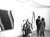
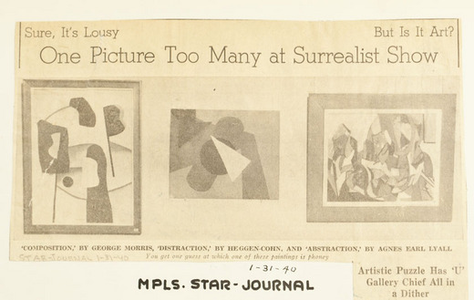
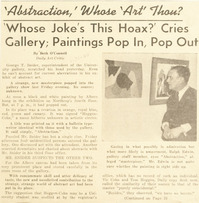
The caption reads: “‘Composition’ by George Morris, ‘Distraction’ by Heggen-Cohn, and ‘Abstraction’ by Agnes Earl Lyall. You get one guess at which one of these paintings is phoney (sic).”

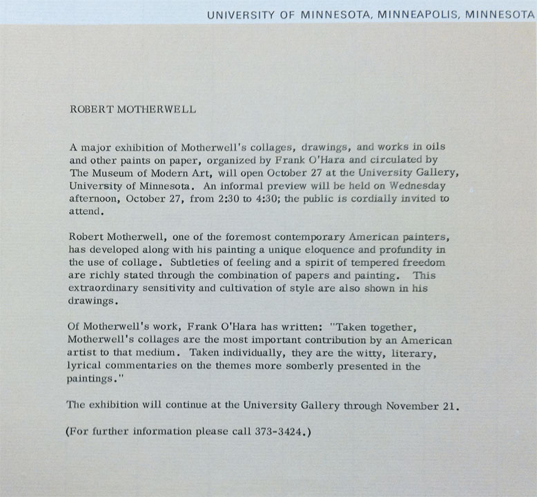
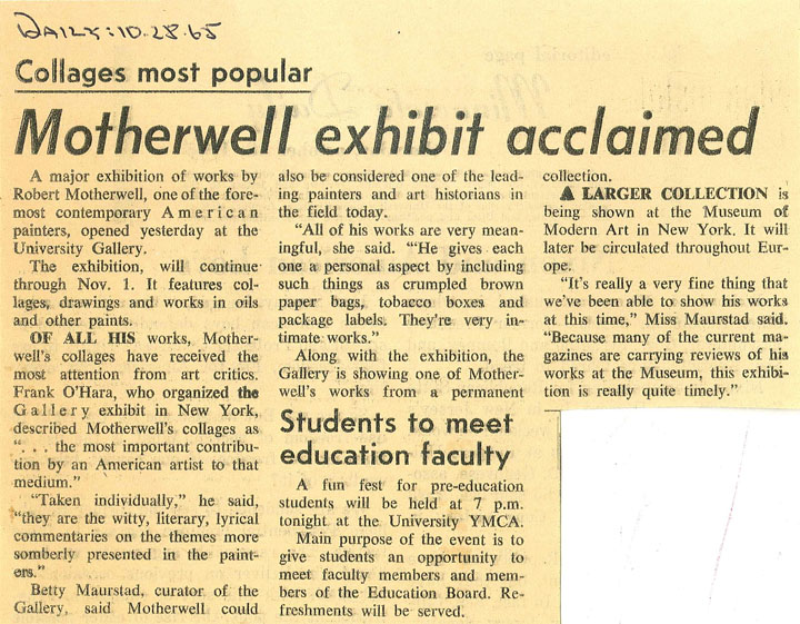
Long before British artist Banksy snuck his paintings onto the walls of several venerable art museums in New York, a pair of University of Minnesota students pulled a similar prank at the University Gallery. In the WAM collection of press clippings from 1940, I found a series of newspaper articles outlining the drama. The January 31, 1940 Star Tribune newspaper article states:

There’s one too many paintings in the abstract art exhibit in Northrop auditorium, and how it got there or what to think of it is baffling the campus…. It’s title is “Distraction,” and it is signed by Heggen-Cohn…. Two fellows by the names of Vic Cohn and Tom Heggen are registered at the university. But they can’t be guilty. Neither owns a beret.

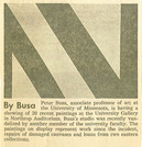
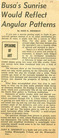
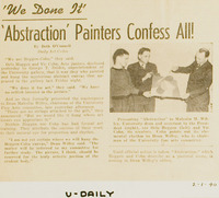
In a Minnesota Daily article from February 1st, juniors Vic Cohn and Orlo Heggen are revealed as the perpetrators, saying, “We done it for the art.” In a Star Tribune story that same day, they confessed to owning a beret, but claimed neither had ever worn it in public. Cohn and Heggen gifted Distraction to University of Minnesota Dean Malcolm Willey, stating, “We would like to have it hung where art lovers will appreciate it.” I wonder whatever became of Distraction?

Prank_clip2.jpg Prank-clip3.jpg
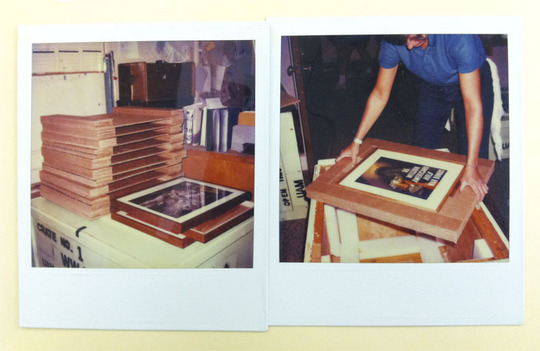
Clippings from the University Daily, Jan. 31 and Feb. 1, 1940


Recaption/Recontext

Recontext-visitor-book.jpg

I’ve come across a few visitor’s register books in the files from the 1980s and 1990s (visitors wrote their name, where they hailed from, and any comments about the show.) I began perusing the register for the 1989 show Recaption/Recontext, featuring photographs from the Cray Research/Film in the Cities collection. The show was curated by photographer Vince Leo, who paired each photograph with a quotation about photography from a variety of sources, thus “recaptioning and recontextualizing” the images. In the catalog, Leo states his general aim is “to agitate against or puncture what we usually think about these photographs in particular, or about photography in general; to open gaps in interpretation instead of closing them.”

Some of the comments in the visitor’s register book about this show caught my eye:

  • Took me back home.
  • Gave me hope.
  • It’s nice to know photography is not dead.
  • It’s bare! But wow!
  • Why are the two pictures pertianing to black people “lent by the artist” and not owned in the collection?
  • I loved the variety. Some photographs leave me entranced and with the need to see more.
  • Deep! / Intense
  • Illuminating a wonderful example of the power of context!
  • I agree – do whatever you must to get your point across – nothing is sacred.

And my favorite comment was simply: “Art?”

 
Invitation for the exhibition “Recaption/Recontext”


Building on Imagination…

Building_imagination_bro.jpg Building-imagination_broch.jpg
The large and oddly-shaped brochure for the University Art Museum’s show Building on Imagination: Architectural Imagery in Children’s Books caught my eye in the files. Soon after, I found a hand-made prototype of the brochure, colored with marker and pasted together, with lines in place for text. I love that the brochure design itself is imaginative and inventive, echoing the towers a child might build.

Building-imagination_broch-side.jpgThe exhibition explored architecture within children books, featuring original illustrations from books such as “Kenny’s Window” by Maurice Sendak, and “King Arthur and the Knights of the Round Table” by Gustaf Tenggren, among others. It toured around the region to 23 sites from 1989 to 1992. The Northfield News wrote of the exhibition in 1991:

“Besides examining architecture in children’s book illustrations, Building on Imagination also highlights children’s experiences of real buildings and of designing make-believe buildings with blocks or blankets in messy bedrooms. A set of stone blocks from the Victorian era included in the exhibition demonstrates the appeal architectural toys have had for children long before Lincoln Logs or Legos became popular.”


Some Assembly Required

Gilbert-mall-3d.jpg
The assembled “Northrup Mall” brochure for the Cass Gilbert exhibition.

In 1982, the University Gallery’s Cass Gilbert: Minnesota Master Architect exhibition was touring around the region. According to the catalog, the exhibition was the first one to focus on his Minnesota years. Cass Gilbert was a world-renowned architect who grew up in St. Paul, Minnesota and designed many famous buildings throughout the country, including the Minnesota State Capital, the Woolworth Building in Manhattan, and the United States Supreme Court Building. He also designed the general scheme of the Northrop Mall at the University of Minnesota—the heart of the East Bank of campus and very familiar to all students here. The University Gallery stood at the head of the mall in Northrup Auditorium, and the effects of Gilbert’s design were surely felt there on a daily basis. (Now the Weisman Art Museum stands just across the street from the mall).

Gilbert-mall-flat.jpgTo illustrate Gilbert’s design concept more concretely, the University Gallery offered a very interesting brochure—one could cut and assemble it into the three-dimensional shape of the mall design. This activity was clearly aimed at kids, but I also had a good time assembling one of the many leftover brochures we found in the files (that’s the uncut version on the left). The explanatory text for the innovative “Archipops” brochure states:

We want to encourage children of all ages to better understand their built environment… Archipops is a chance to examine one significant design and learn to ask some questions about it. The model of Cass Gilbert’s Mall is a tool for understanding a talented architect’s solution to the question how to organize the campus of the University of Minnesota.

Gilbert_Archiprops.jpg CassGilbert_catalog.jpg
The Archipops brochure and the cover of the exhibition catalog.


All the Way to the Bank

Installation drawing for the John Rood sculpture Return of John Brown

The University Gallery assisted with the installation of two John Rood sculptures in the National American Bank in Minneapolis in 1975. (Rood was a professor of art at the University if Minnesota from 1944-1946.) On the surface this is not a particularly interesting topic, but I quite liked these installation drawings I found in the files. The carefully rendered drawings show the sculptures with a stylishly-dressed customer for scale, and are interesting drawings by themselves. The attached typed captions detail how each sculpture will be mounted: “The sculpture’s plate is mounted on top of a column which is secured to a rectangular, weighty platform. The material is walnut stained birch plywood.”


Installation drawing of a John Rood sculpture, and photographs of the two sculptures


Robert Motherwell

Motherwell_poster.jpg

Robert Motherwell was featured in the University Gallery in 1965, in a traveling exhibition from the Museum of Modern Art. Motherwell was part of the New York School (which included Jackson Pollock, Mark Rothko, and Willem de Kooning) and his work is likewise in the Abstract Expressionist vein. His distinctive style of painting with rich black blobs and swaths is on display in this poster for the show, and in the photographs from the opening.

The press release from the Gallery describes Motherwell and his style:

Robert Motherwell, one of the foremost contemporary painters, has developed along with his painting a unique eloquence and profundity in the use of collage. Subtleties of feeling and a spirit of tempered freedom are richly stated through the combination of papers and painting. This extraordinary sensitivity and cultivation of style are also shown in his drawings.

The Weisman Art Museum still has in its collection an important piece from Motherwell, called Mural Fragment. This piece caused some controversy when it first came to the University in 1965, to be displayed in the Duluth student center. Some students and faculty petitioned for its removal, stating “We feel a better example of modern art could have been selected, rather than this crude daub that looks like a deformed octopus alongside of two decayed dinosaur eggs.” Beauty is in the eye of the beholder, I guess. The gallery director kept the painting up.
Read more about Motherwell and Mural Fragment here.


The Motherwell opening at the U Gallery

Press release and news clipping from The Daily


Frank Pearson

Pearson_poster.jpg

In the Ivory Tower literary magazine, student Roger Horrocks wrote of his visit to the Frank Pearson exhibit in 1965:

Entering the University Gallery (that claustrophobic white corridor which reminds me of a ship’s passageway), I was overwhelmed by the blaze of color pouring out from a series of diamond-shaped, T-shaped, and upside-down-L-shaped canvases. At first, I approved of the disciplined geometrical forms, but felt very irritated by the color. There appeared to be not the slightest attempt to blend or harmonize different tints, not one painting on which the eye could rest peacefully.

Horrocks did warm up to the paintings eventually, appreciating their optical illusion qualities.
The painter Frank Pearson was a faculty in the University of Minnesota Art Department at the time of his show. Pearson resigned suddenly after only one and a half years on the faculty, and if you’d like to know why, take a look at the Peter Busa entry on this blog and venture a guess…

 
Frank Pearson talking with Sidney Simon (director of the U Gallery), and student Roger Horrocks. On the right, a photograph from the opening.

Pearson_color.jpg
Color images of Pearson’s paintings from 1965. The color images have cracked, while the black and white images of the show have held up.


Peter Busa

The lead-up to Peter Busa’s exhibition at the University Gallery in 1966 held some dramatic twists and turns. Busa was a professor of art at the University of Minnesota at the time. Just 3 months before his show was to be installed in the University Gallary, a vandal broke into his studio and slashed, burned, and otherwise damaged or destroyed many of Busa’s paintings.

Busa worked quickly to repair and repaint the canvases that could be salvaged, and created new works to fill in for destroyed ones. His solo show went forward as planned, somewhat miraculously.

Perhaps the strangest aspect of this story is that the “prime suspect” was another member of the University Art Department faculty… my, what a tangled web we weave.

busa2.jpg busa4.jpg busa1.jpg
Photos from the Peter Busa opening at the University Gallery
busa-clips5.jpg busa-clips4.jpg
Newspaper clippings from the file about the exhibition and vandalism


Ernst Josephson

Josephson_poster.jpg
Thanks to the keen eyes and wits of the University Archives staff, we found a trove of posters for University Gallery exhibitions throughout its history. They are beautiful remembrances of the shows, particularly many of the colorful posters from the 1960s. We’ll be featuring some of these posters throughout the next few months, along with images from the gallery and openings.

Ernst Josephson‘s drawings and paintings were exhibited in the University Gallery in 1965. The poster features a stylized image of Josephson himself. He was born in 1851 in Sweden, and in 1887 was diagnosed with schizophrenia—the poster design above seems to hint at his state of mind. During this time his style altered, becoming more abstract (his work was later seen as a pre-cursor to the styles of Matisse and Picasso). One reviewer of the U Gallery show in the Minneapolis Tribune says:

Josephson’s art is full of idiosyncrasy, of drawing things the “wrong” way that turn out to be right…. The drawings are a strange world in themselves. Josephson’s line is quixotic, kinetic, yet sustains an airy delicacy and a fine judgment in filling the rectangle with wiry strength.


Opening for Ernst Josephson in 1965. Sidney Simon, the director of the U Gallery, can be seen in the image on the left.


A Packed House

war_posters-unpack2.jpg

Packing artwork or other delicate artifacts is something of an art itself, and museums need to have it down pat. The objects must fit snugly and be protected from jostling and the elements. This is particularly tricky with traveling exhibits, such as this 1984 show Making America Strong: World War II Posters, created by the University Art Museum. These polaroids document the behind-the-scenes packing process (or perhaps unpacking, it’s hard to tell!) of the framed posters at the Museum.

war_posters_unpack1.jpg War_posters-poster.jpg
Packing/unpacking for the show, and a poster for the show in St. Cloud